• I am currently working on new case studies. In the meantime, please feel free to look around!

Expedia Group

Expedia Cruise Customer Experience Enhancements

CHALLENGE
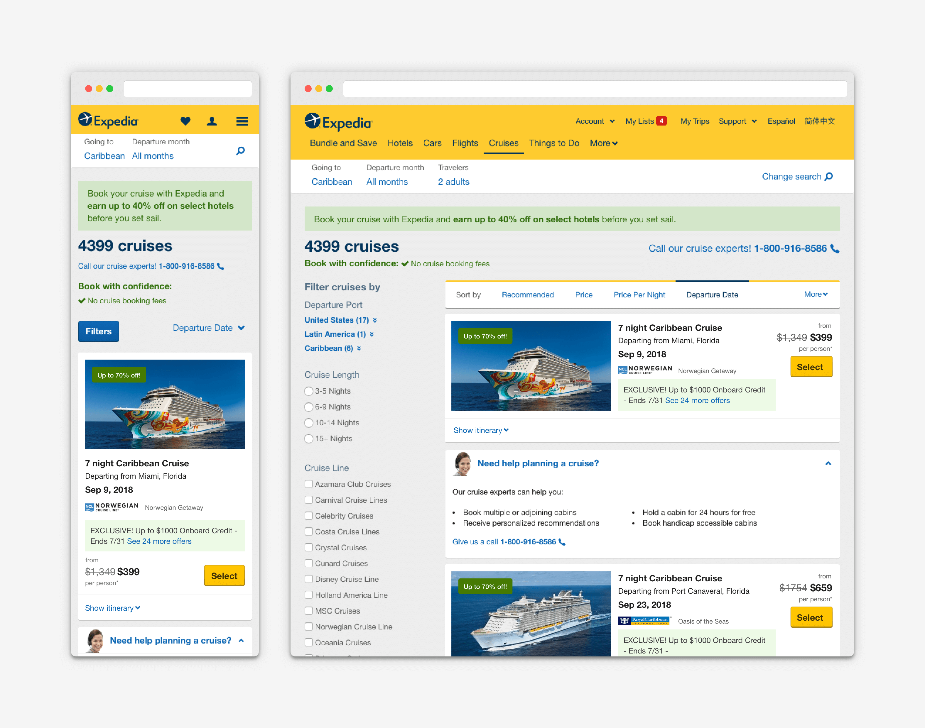
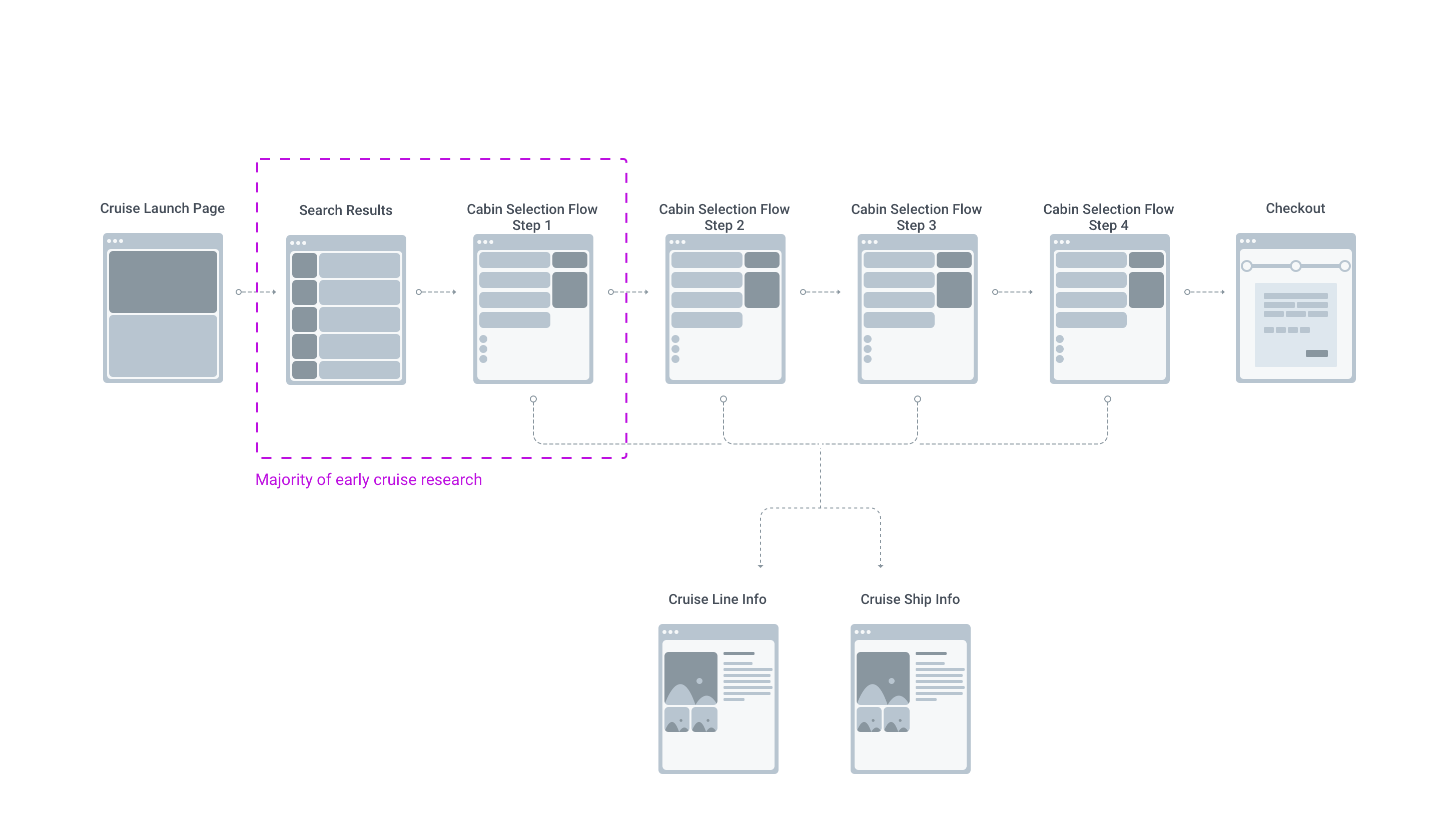
Millions of users on Expedia search cruises. Booking a cruise is a more thought out purchase and research tells us that users do their homework months in advance before booking an itinerary. The overall goal is to increase traffic and revenue, however, to get there it begins with the online experience up front when a user is searching for a cruise to book. 
ROLE
  • Research, UX/UI Design, Prototype
OBSERVATIONS
There were new findings based on the A/B test with single sailing listings. We also learned that users were still looking for specific itinerary and map information in their cruise research. New research has shown that most users are not geographically knowledgeable of the various ports associated with sailing itineraries. Additionally, feedback from call centers have stated that current layout is not mobile friendly to easily compare listings.

DISCOVERY And Analyzing the data

Collectively as a team, we felt that we needed to start with our cruise search results page based on the data. Unmoderated researched informed us that users where looking for more specific information at the search results page. The overall goal is to increase traffic and revenue, however, to get there it begins with the online experience up front when a user is searching for a cruise to book.

WIREFRAME EXPLORATIONS

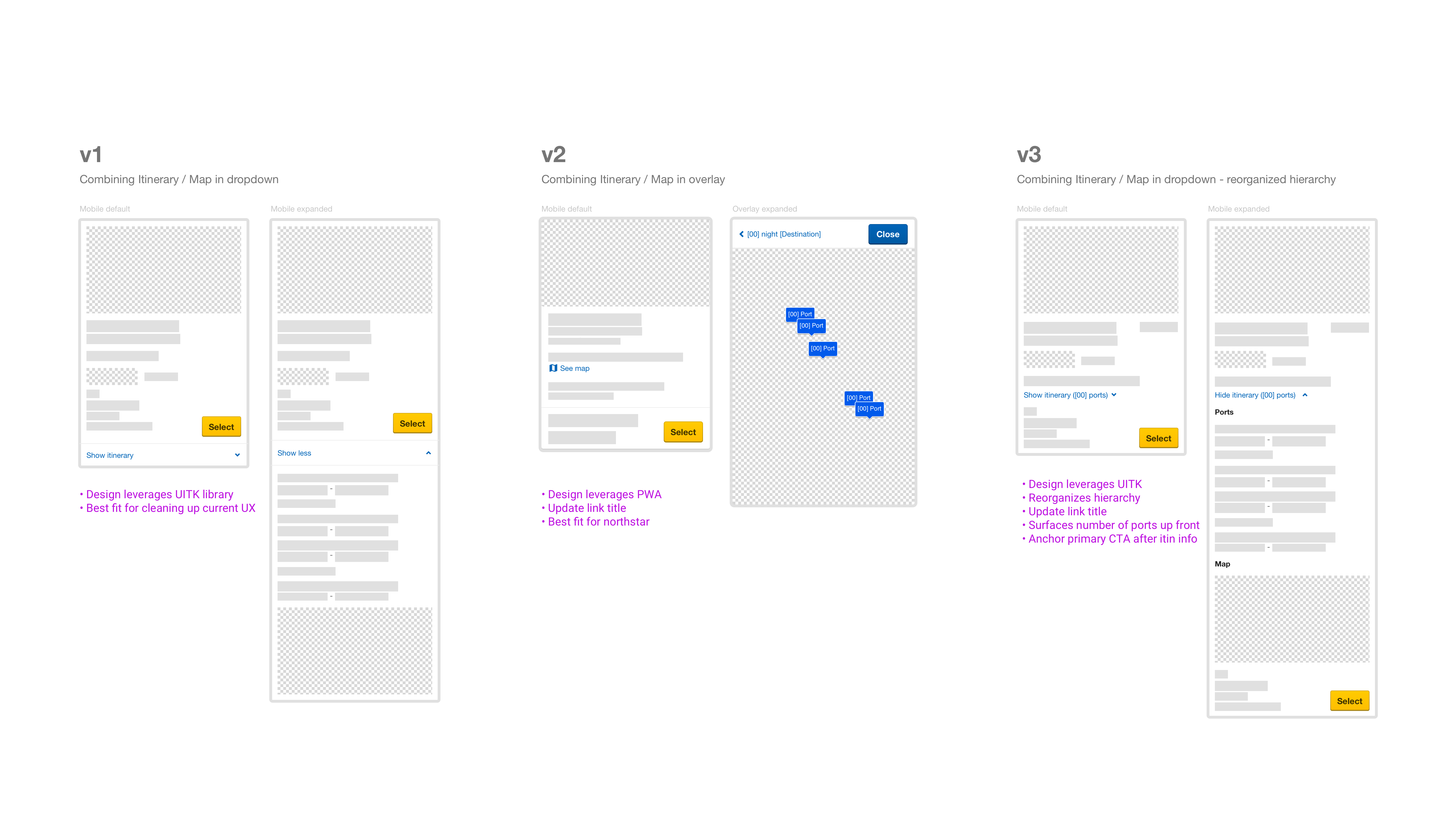
Low Fidelity Explorations
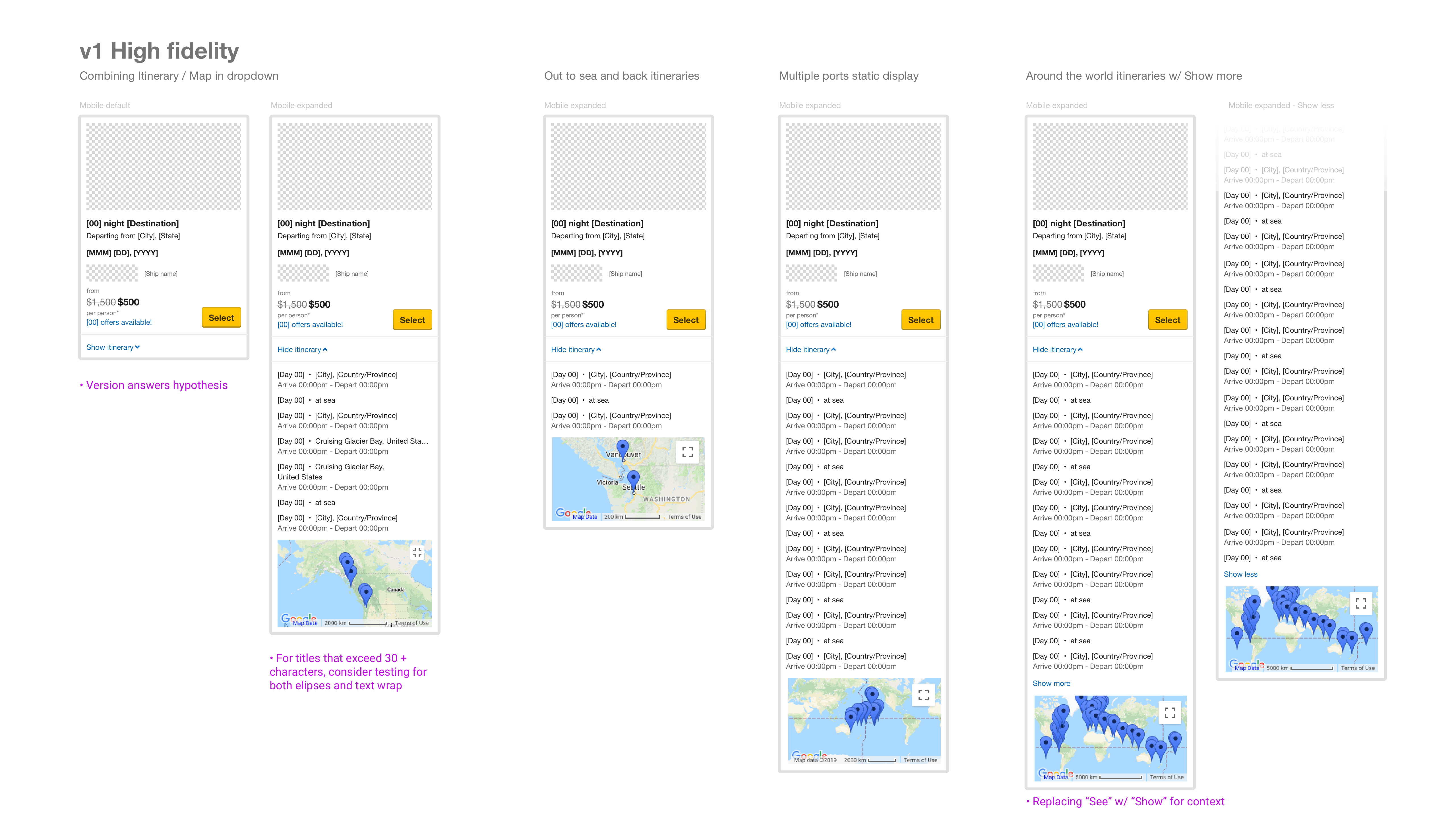
Recommended High Fidelity Mocks and Edge Cases
RESULTS
My recommendation was to combine the itinerary and map in a single dropdown tray so that users had easy access to compare other cruise information, especially at mobile. The business analytics showed overall funnel progression from the search results page to the cabin selection increased by over 7% (3% mobile)
© 2021 Johnny Terlaje. All rights reserved.